Fonts size in pt or em?? em in CSS in questfox
Posted: 11. April 2023 Filed under: Uncategorized Leave a commentThe terms “pt” and “em” are units of measurement used in typography and web design to specify the size of fonts, among other things. Here’s how they differ:
| Points (pt) | Ems (em) |
| Absolute Unit: Points are an absolute unit of measurement, traditionally used in print media. Fixed Size: One point is equal to 1/72 of an inch. This means that if you set a font size to 12pt, it will always be 12pt, regardless of the parent element’s size or the screen resolution. Print-Friendly: Given their fixed nature and historical use in print, points are often used in documents intended for printing, like PDFs and Word documents. Device-Dependent: The actual size of a point can vary between devices, especially between print and screen, but it remains a fixed unit. | Relative Unit: Ems are a relative unit of measurement, commonly used in web design and development. Dynamic Size: The size of 1em is determined by the font size of its closest parent element that has a set font size. If the parent has a font size of 16px, then 1em will be equal to 16px for that element. Scalability: Because they are relative, em units are more scalable and responsive. They allow for more fluid layouts that adapt to different screen sizes and resolutions. Nesting Impact: The em unit is affected by the font size of parent elements, which means that nested elements can compound and potentially lead to unexpectedly large or small text. |
Font size in PT (point) is an absolute size based on the physical size of a point. One point equals 1/72 inch or 0.35 mm. The font size in PT remains constant regardless of the size of the screen or display unit. So you better NOT use PT inside of questfox as the size is fixed and not adaptive to different screen sizes.
Font size in EM is a relative size based on the size of the font. An EM is equal to the width of the uppercase “M” in the font. The font size in EM adapts to the size of the screen or display unit.
Another difference is that font size in PT is typically used for print while font size in EM is used for screen and web design.
We are sorry, that most of the font settings inside of questfox come from the times before the standardization of em in html was established. We recommend to use only em as a setting in the CSS definition of your project.
font-size: 1.6 em is for example a major increase in 60% of size. But the actual size depends on the device and the technical context used.
When questfox was created everything was designed to happen in PT. We now regret the definition which you can find anywhere in the software and recommend you to use CSS with the definition of filesize in pt.
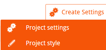
The definition of the CSS is defined underneath

In this textfield you find a basic definition for your project that you can overwrite with your settings.
Examples:
Font of the question
.questionText > span > p{
font-size: 1.4em;
font-weight: 400;
}
Change of answer text size
.answerItemLabel{
font-size: 1.3em;
font-weight: bold;
}
Multiple Choice answer buttons
.answerItem{
font-size: 1.6em;
font-weight: bold;
}
/*Definition Tinsort Buttons with integrated Font and different color*/
.btn{
font-size: 1.2em;
font-family: ‘TeleNeo’, sans-serif;
color: #262626;
}
 questfox News